Innovamol is growing, and with that growth the way we tell our story is evolving too. Over recent years, we have consolidated a strong position in the B2G market, delivering complex, highly regulated, high-impact scientific projects. Today, within a broader strategic plan, we are taking the next step: strengthening our presence in the B2B market by bringing the know-how built in the field to the forefront and making it immediately recognisable.
This is where the rebrand begins. It is not merely an aesthetic exercise, but a systemic intervention: a visual identity designed to support Innovamol’s activities through its current evolution, maintaining continuity with our history while making clearer who we are today.
From symbol to sign: what changes
The previous logo was strongly descriptive: uppercase lettering, a registered mark, and a three-dimensional “molecular” element that directly recalled the chemical imaginary. It was coherent with the company’s origins and with a more technical communication style.
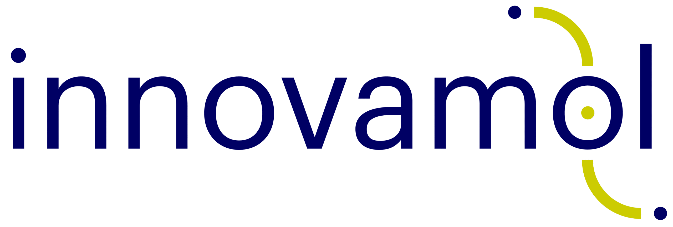
The new logo moves in the opposite direction: it simplifies, organises, and becomes modular. The lettering shifts to lowercase, more contemporary and digital, while the distinctive element is integrated around the final “o”: a nucleus (the dot) and two curved trajectories, accompanied by two satellites, evoking scientific data connection, interpretation journey, idea exchange, and precision in the delivery. Furthermore, the reference to our scientific soul not only remains but becomes truly essential it a way that does not represent simply “a molecule” but synthesises a method.
Fewer elements, more character
One of the main objectives was to “clean up” the communication: fewer signs, more intent. For this reason, the brandbook defines an essential, high-contrast palette: White, Night Blue, and Golden Green. Three colours that perform well both in institutional contexts (documents, reports, presentations) and in digital and commercial settings (web, marketing materials), ensuring recognisability even in monochrome.
Typography follows the same logic: clean, professional, and highly legible. Typographic consistency is key to strengthening the perception of reliability, especially for a B2B audience accustomed to assessing clarity, trustworthiness, and attention to detail at a glance.
A system, not just a logo
The redesign does not stop at the mark. We have built a visual language that can live across multiple channels: the texture derived from the sign (repeated curves and dots) becomes a pattern for covers, backgrounds, and editorial materials, creating continuity without adding visual weight. It reflects the core idea behind the project: a few modules, used with discipline, enabling many applications.
What it means in practice
With this update, our goal is to make all touchpoints more consistent: the website, Innovablog, commercial decks, reports, project templates, event materials, and everyday communication. A more ordered communication is not only “more beautiful”: it is faster to read, easier to remember, and simpler to scale as the organisation grows.
The new brand is therefore a clear signal: Innovamol aims to communicate with the authority built in the B2G market, using a more contemporary and competitive language. The substance remains; the form is now aligned with our ambition.
Over the coming months, we will apply this identity more pervasively across the website, materials, and services, with one objective in mind: to make it increasingly immediate to understand what we do and how we work.
“Change is the law of life. And those who look only to the past or present are certain to miss the future” – John F. Kennedy